Reframing Compliance Coverage to Drive Growth

Timeline
1 Month
Client
My role
End to End product design
cOLLABORATORS


Introduction
This case study shows how reframing Deel’s compliance coverage during contract creation boosted adoption and unlocked millions in ARR. By shifting the focus from “add-ons” to risk awareness and clearer product names, we helped clients understand the value and make informed choices.
My Role
I led the project end-to-end as product designer - research, strategy, design, and delivery - partnering closely with product, compliance, and growth teams.
Impact
The project is work in progress. Additional screens, details and ideas will be added over time. See below the progress so far.
Figures and names are fictitious and for illustrative purposes only.


Sarah Johnson
Senior Sales Rep, Deel

Brian Doe
Employee misclassification occurs when a worker is incorrectly categorized as an independent contractor instead of an employee, or vice versa. This misclassification can affect access to benefits, protections under labor laws, and tax implications for both the worker and the employer.
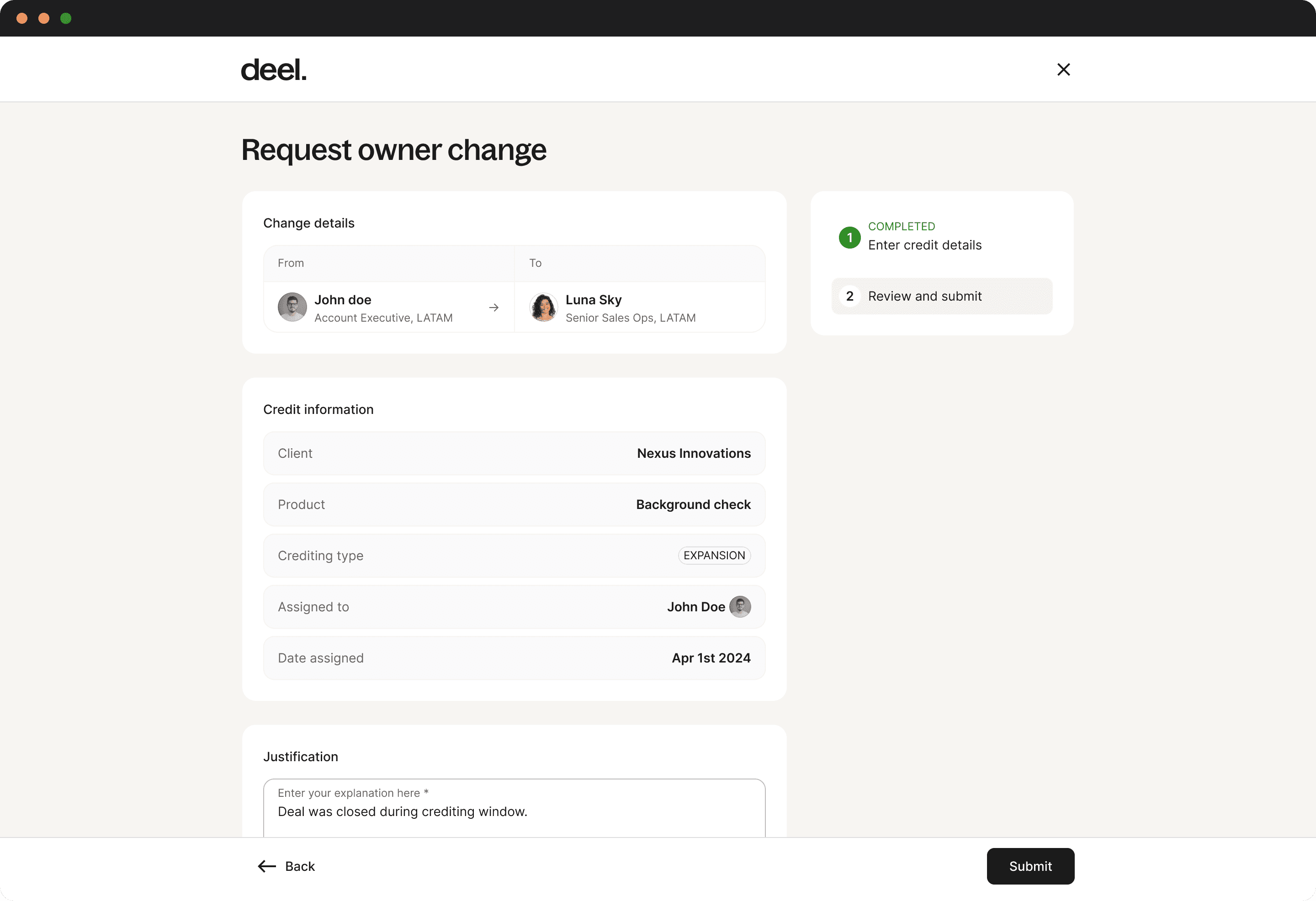
Rather than positioning compliance coverage as transactional add-ons, I redesigned the experience to help clients understand why protection matters and make an informed choice.
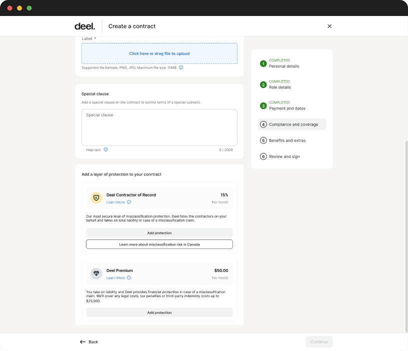
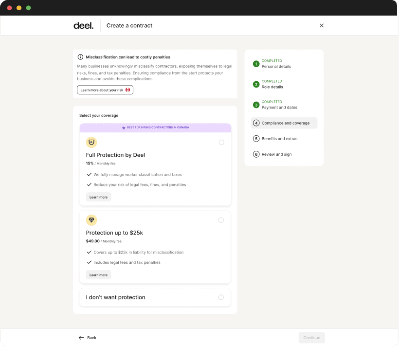


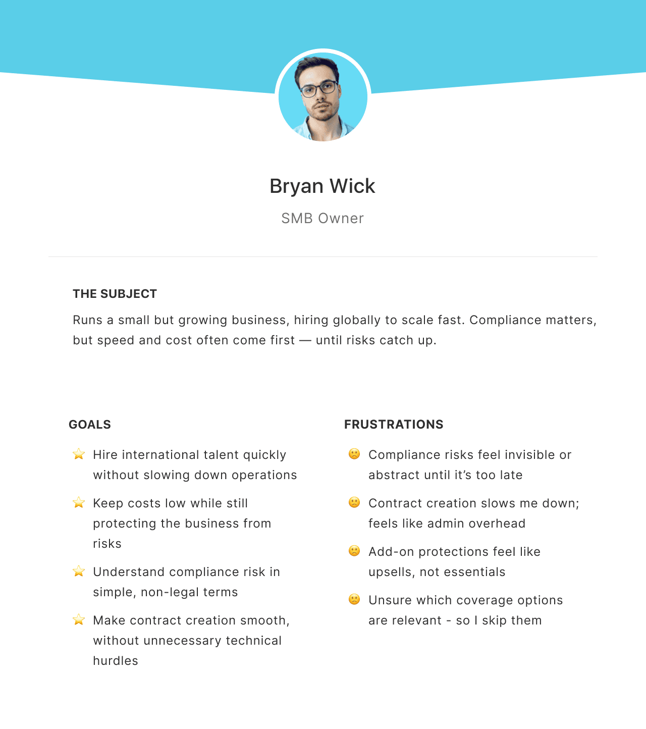
We targeted small and medium businesses: fast-growing, hiring globally, and moving quickly. Unlike enterprises, SMBs lack dedicated compliance teams - making them more exposed to misclassification risks.
Through interviews, we learned SMB owners value speed and simplicity but often struggle to understand compliance risks. They want protection - without the legal jargon or extra admin.

I needed to understand why the system was saying no. To uncover the root cause, I broke down rejection reasons.
Two patterns showed up across all months:
Duplicate/ Already Exists
Unpaid Invoices
These accounted for 40-50% of all rejections. It wasn’t user error.
It was missing context.

When I traced how reps interacted with the credit form, it became clear: It was a straight line -no checks, no nudges, no context.

To stress-test my assumption, I spoke with multiple reps. Their responses confirmed the hidden friction. Turns out, the system wasn’t just silent - it relied on tribal knowledge. New reps were left guessing. Experienced reps were shortcutting. Everyone was operating on assumptions.
Brian Doe
Sales (New joiner), Deel
Sarah Johnson
Senior Sales Rep, Deel

Alex Tiran
Account Executive, Deel
Reps couldn’t see if a credit already existed or if the invoice was unpaid.
RevOps spent hours each week reviewing invalid requests that could’ve been caught earlier.
A written procedure existed - but new reps didn’t know it, and veterans often ignored it.
70% of credit requests were rejected due to missing context (e.g. invoice status, ownership).
Now that we understood the real problem wasn’t a form- it was feedback- we mapped the breakdowns across the user journey and spotted opportunities where a small nudge could drive outsized impact.

Missing credits weren’t caused by bad reps - but by invisible logic. So I reframed the problem: not how to collect better inputs, but how to design smarter defaults. Using existing data - like invoice status and credit assignments - I mapped a smarter, preventive flow that would catch most mistakes before they’re submitted.


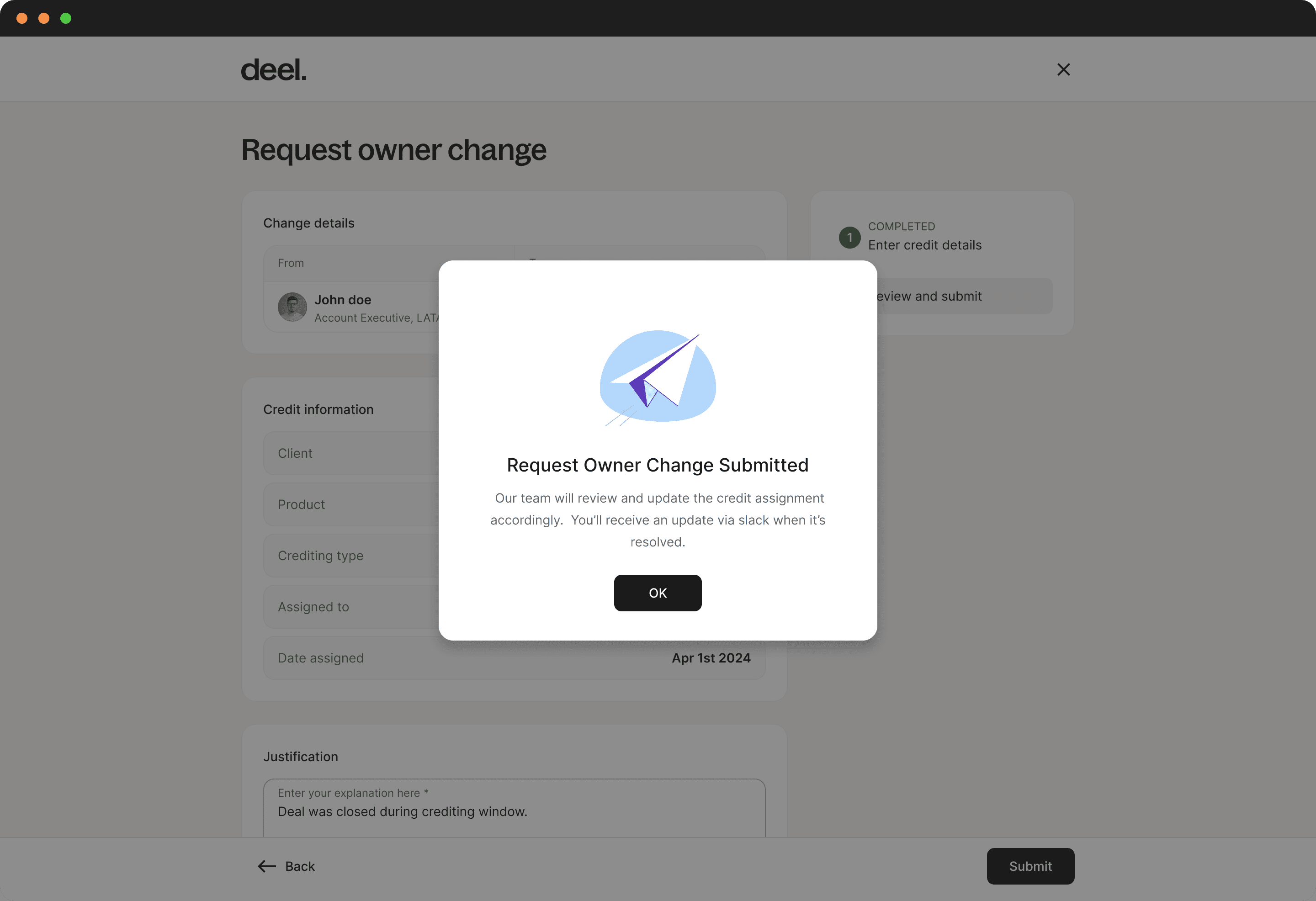
/Submission accuracy
By flagging missing context in real time, reps corrected issues before hitting submit - reducing guesswork and boosting trust.
/RevOps ticket volume
Smarter submissions meant fewer unnecessary tickets, easing the load on RevOps and speeding up valid requests.
/Monthly hours saved
Time previously spent reviewing avoidable tickets was reclaimed, letting RevOps focus on higher-value work.
🎉
I was honestly shocked that RevOps and Sales had been working around this issue for months. The data to flag the problem was there all along - but no one surfaced it. It made me realize that even the simplest fixes often stay hidden until someone’s willing to dig through the mud.
✍️
Main lesson
Impact doesn’t always require heavy lifts. Sometimes, a small nudge at the right moment can drive major change.
Keep it simple
Minimal animation, fewer choices. Solely essential components included. Everything else of the screen remains whitespace.
Key principles
Navigation: Always visible tabbar
Labels. Icons. Contacts. No guessing
Filter: reduce overload
No 'hidden' features. WYSIWYG
Limited configuration options
The project is work in progress. Additional screens, details and ideas will be added over time. See below the progress so far.
Figures and names are fictitious and for illustrative purposes only.
Thank you for scrolling!